Recreate Economist graph by ggplot2
Posted on March 03, 2017
In this blog we would use some of those techniques to reproduce a graphic from the Economist ( Most of the part of this blog has been taken from the Harvard Labs class of Introduction to R Graphics )
Challenge: Recreate This Economist Graph
Graph source: http://www.economist.com/node/21541178
Building off of the graphics you created in the previous exercises, put the finishing touches to make it as close as possible to the original economist graph.
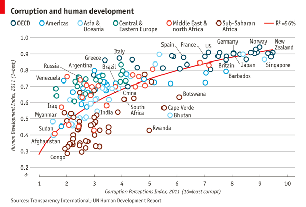
Challenge Solution
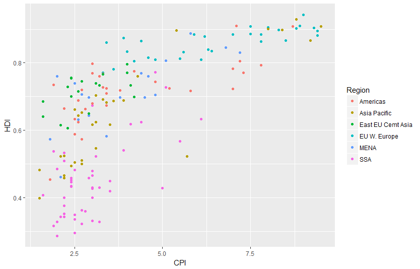
Lets start by creating the basic scatter plot using Economist Data, then we can make a list of things that need to be added or changed. The basic plot loogs like this:
dat <- read.csv("/data/EconomistData.csv")

  pc1 <- ggplot(dat, aes(x = CPI, y = HDI, color = Region))
  pc1 + geom_point()
To complete this graph we need to:
- add a trend line
- change the point shape to open circle
- change the order and labels of Region
- label select points
- fix up the tick marks and labels
- move color legend to the top
- title, label axes, remove legend title
- theme the graph with no vertical guides
- add model R2 (hard)
- add sources note (hard)
- final touches to make it perfect (use image editor for this)
Adding the trend line
Adding the trend line is not too difficult, though we need to guess at the model being displyed on the graph. A little bit of trial and error leds to
(pc2 <- pc1 +
     geom_smooth(aes(group = 1),
                 method = "lm",
                 formula = y ~ log(x),
                 se = FALSE,
                 color = "red")) +
     geom_point()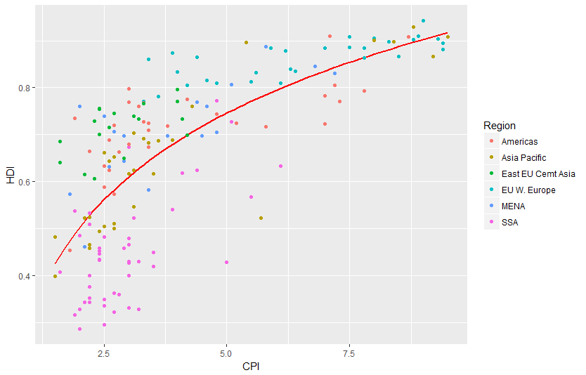
Notice that we put the geom_line layer first so that it will be plotted underneath the points, as was done on the original graph
Use open points
This one is a little tricky. We know that we can change the shape with the shape argument, what what value do we set shape to? The example shown in ?shape can help us:
 # A look at all 25 symbols
  df2 <- data.frame(x = 1:5 , y = 1:25, z = 1:25)
  s <- ggplot(df2, aes(x = x, y = y))
  s + geom_point(aes(shape = z), size = 4) + scale_shape_identity()
  # While all symbols have a foreground colour, symbols 19-25 also take a
  # background colour (fill)
  s + geom_point(aes(shape = z), size = 4, colour = "Red") +
    scale_shape_identity()
  s + geom_point(aes(shape = z), size = 4, colour = "Red", fill = "Black") +
    scale_shape_identity()
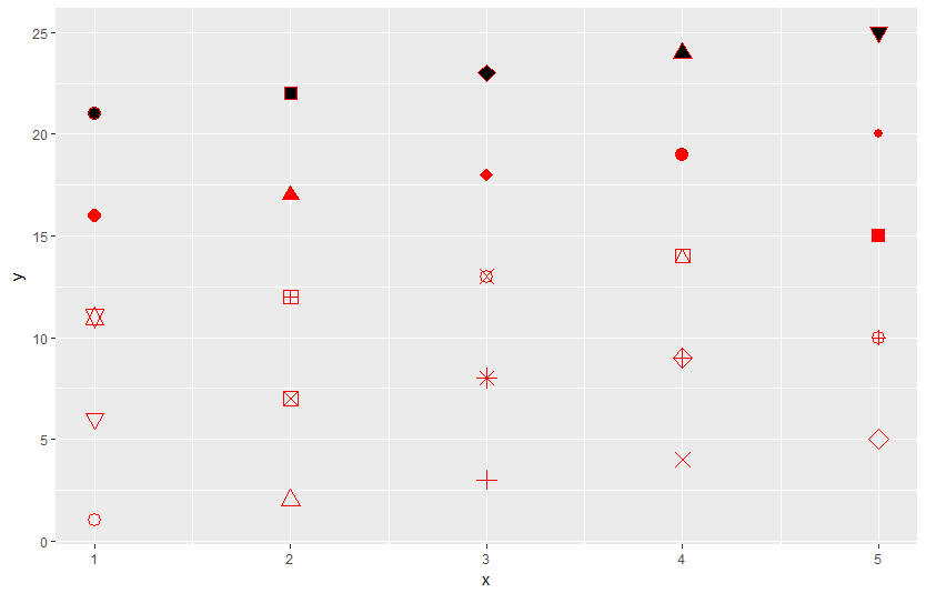
This shows us that shape 1 is an open circle, so
pc2 +
geom_point(shape = 1, size = 4)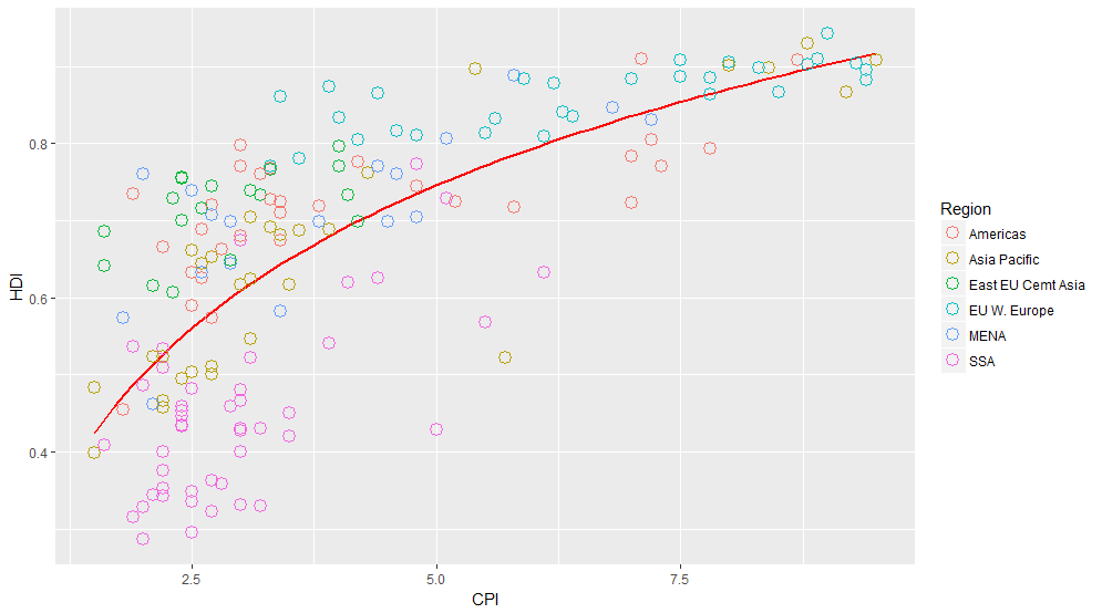 That is better, but unfortunately the size of the line around the points is much narrower than on the original. This is a frustrating aspect of ggplot2, and we will have to hack around it. One way to do that is to multiple point layers of slightly different sizes.
(pc3 <- pc2 +
     geom_point(size = 4.5, shape = 1) +
     geom_point(size = 4, shape = 1) +
     geom_point(size = 3.5, shape = 1))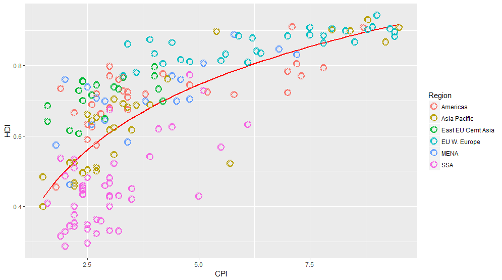
Labelling points
This one is tricky in a couple of ways. First, there is no attribute in the data that separates points that should be labelled from points that should not be. So the first step is to identify those points.
pointsToLabel <- c("Russia", "Venezuela", "Iraq", "Myanmar", "Sudan",
                     "Afghanistan", "Congo", "Greece", "Argentina", "Brazil",
                     "India", "Italy", "China", "South Africa", "Spane",
                     "Botswana", "Cape Verde", "Bhutan", "Rwanda", "France",
                     "United States", "Germany", "Britain", "Barbados", "Norway", "Japan",
                     "New Zealand", "Singapore")
Now we can label these points using geom_text, like this:
(pc4 <- pc3 +
    geom_text(aes(label = Country),
              color = "gray20",
              data = subset(dat, Country %in% pointsToLabel)))
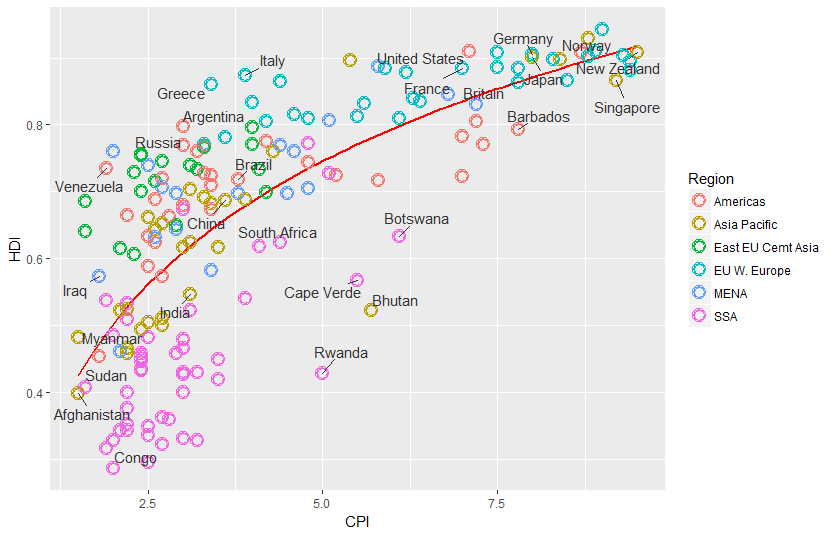
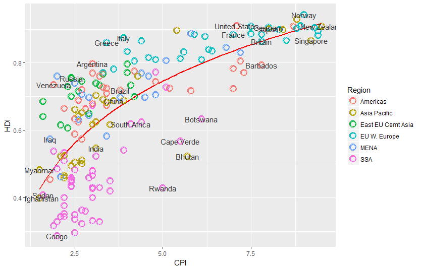 This more or less gets the information across, but the labels overlap in a most unpleasing fashion. We can use the ggrepel package to make things better, but if you want perfection you will probably have to do some hand-adjustment.
library("ggrepel")
  pc3 +
    geom_text_repel(aes(label = Country),
              color = "gray20",
              data = subset(dat, Country %in% pointsToLabel),
              force = 10)
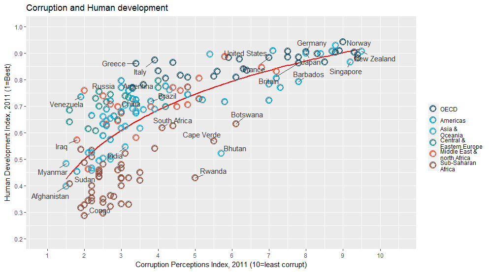
Change the region labels and order
Thinkgs are starting to come together. There are just a couple more things we need to add, and then all that will be left are themeing changes.
Comparing our graph to the original we notice that the labels and order of the Regions in the color legend differ. To correct this we need to change both the labels and order of the Region variable. We can do this with the factor function.
dat$Region <- factor(dat$Region,
                       levels = c("EU W. Europe",
                                  "Americas",
                                  "Asia Pacific",
                                  "East EU Cemt Asia",
                                  "MENA",
                                  "SSA"),
                       labels = c("OECD",
                                  "Americas",
                                  "Asia &\nOceania",
                                  "Central &\nEastern Europe",
                                  "Middle East &\nnorth Africa",
                                  "Sub-Saharan\nAfrica"))
Now when we construct the plot using these data the order should appear as it does in the original.
pc4$data <- dat
  pc4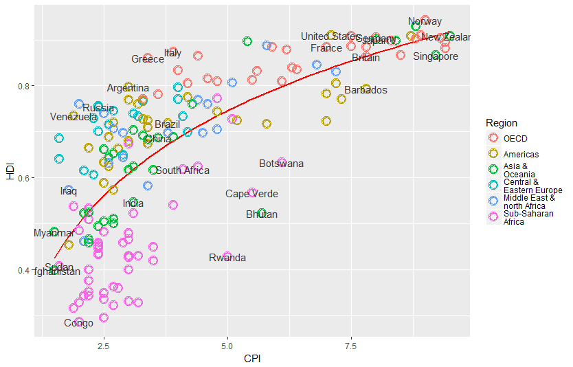
Add title and format axes The next step is to add the title and format the axes. We do that using the scales system in ggplot2.
library(grid)
  (pc5 <- pc4 +
    scale_x_continuous(name = expression(italic("Corruption Perceptions Index, 2011 (10=least corrupt)")),
                       limits = c(.9, 10.5),
                       breaks = 1:10) +
    scale_y_continuous(name = expression(italic("Human Development Index, 2011 (1=Best)")),
                       limits = c(0.2, 1.0),
                       breaks = seq(0.2, 1.0, by = 0.1)) +
    scale_color_manual(name = "",
                       values = c("#24576D",
                                  "#099DD7",
                                  "#28AADC",
                                  "#248E84",
                                  "#F2583F",
                                  "#96503F")) +
    ggtitle("Corruption and Human development"))
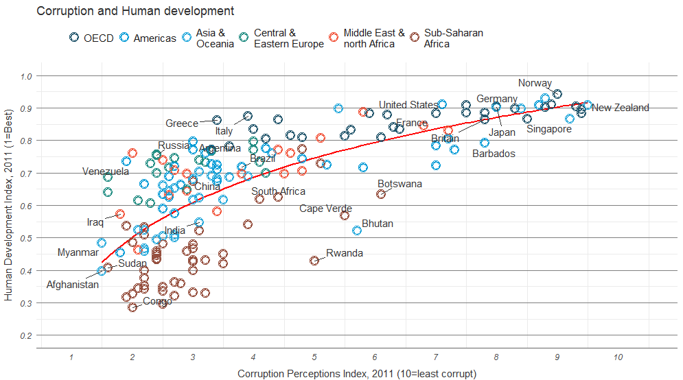
Theme tweaks
Our graph is almost there. To finish up, we need to adjust some of the theme elements, and label the axes and legends. This part usually involves some trial and error as you figure out where things need to be positioned. To see what these various theme settings do you can change them and observe the results.
(pc6 <- pc5 +
    theme_minimal() + # start with a minimal theme and add what we need
    theme(text = element_text(color = "gray20"),
          legend.position = "top", # position the legend in the upper left
          legend.direction = "horizontal",
          legend.justification = c(0.1,0), # anchor point for legend.position.
          legend.text = element_text(size = 11, color = "gray10"),
          axis.text = element_text(face = "italic"),
          axis.title.x = element_text(vjust = -1), # move title away from axis
          axis.title.y = element_text(vjust = 2), # move away for axis
          axis.ticks.y = element_blank(), # element_blank() is how we remove elements
          axis.line = element_line(color = "gray40", size = 0.5),
          axis.line.y = element_blank(),
          panel.grid.major = element_line(color = "gray50", size = 0.5),
          panel.grid.major.x = element_blank()
    ) + guides(colour = guide_legend(nrow = 1))) # forces legend to be in a single line
Add model R2 and source note
The last bit of information that we want to have on the graph is the variance explained by the model represented by the trend line. Lets fit that model and pull out the R2 first, then think about how to get it onto the graph.
(mR2 <- summary(lm(HDI ~ log(CPI), data = dat))$r.squared)OK, now that we’ve calculated the values, let’s think about how to get them on the graph. ggplot2 has an annotate function, but this is not convenient for adding elements outside the plot area. The grid package has nice functions for doing this, so we’ll use those.
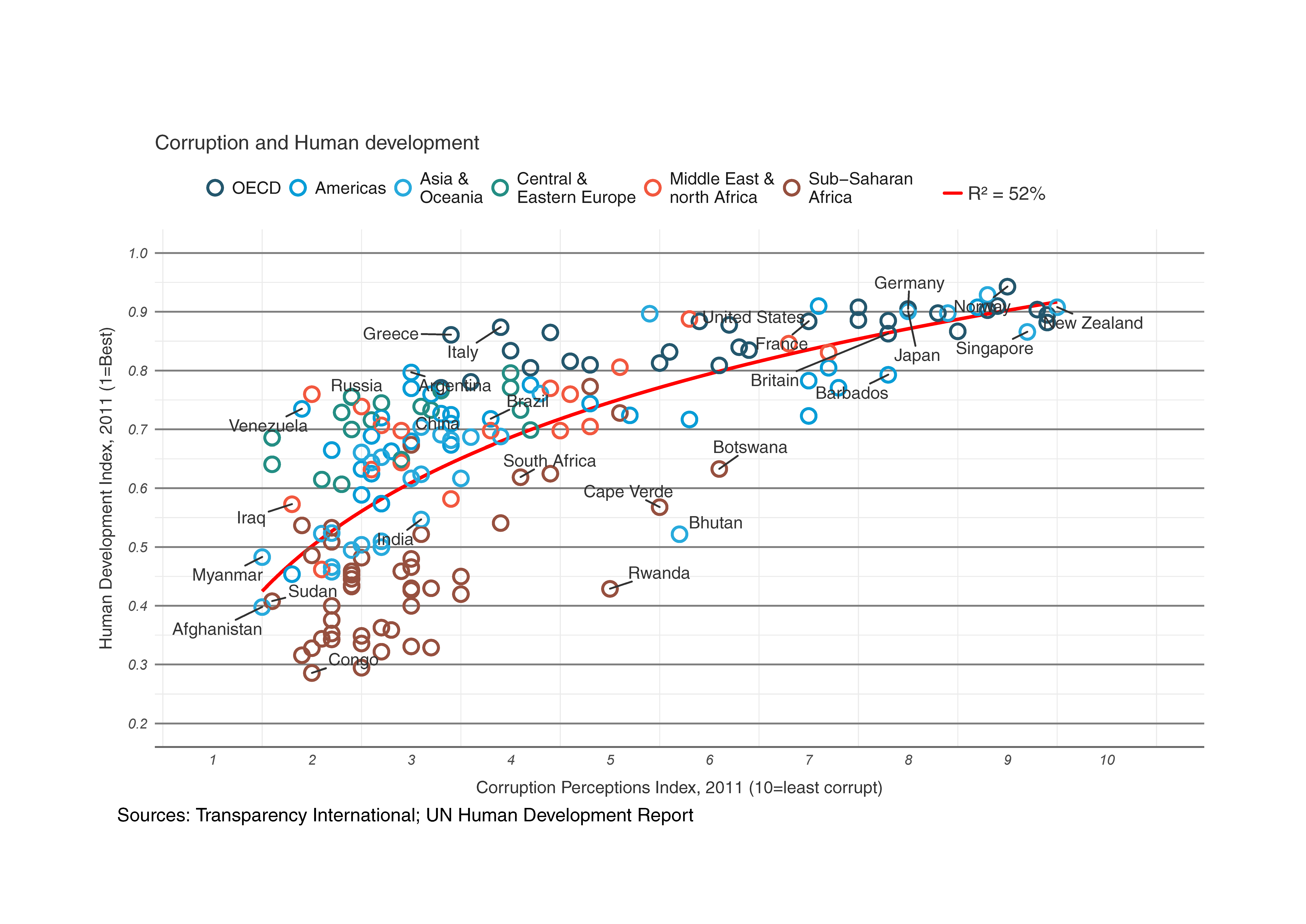
And here it is, our final version!
library(grid)
  png(file = "economist.png", width = 800, height = 600)
  pc6
  grid.text("Sources: Transparency International; UN Human Development Report",
           x = .02, y = .03,
           just = "left",
           draw = TRUE)
  grid.segments(x0 = 0.81, x1 = 0.825,
                y0 = 0.90, y1 = 0.90,
                gp = gpar(col = "red"),
                draw = TRUE)
  grid.text(paste0("R² = ",
                   as.integer(mR2*100),
                   "%"),
            x = 0.835, y = 0.90,
            gp = gpar(col = "gray20"),
            draw = TRUE,
            just = "left")

  dev.off()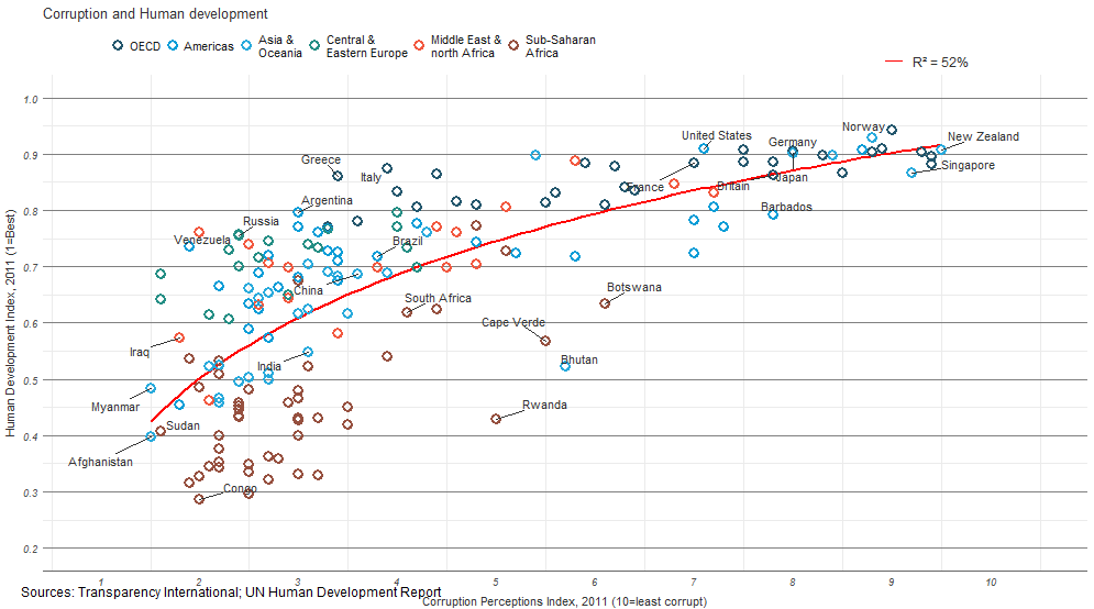
Modification by Adobe Illustrator
Comparing it to the original suggests that we’ve got most of the important elements, though of course the two graphs are not identical.
 Comparing it to the original suggests that we’ve got most of the important elements, though of course the two graphs are not identical.
### all code in a file
library(ggplot2)
library(ggrepel)
library(grid)

dat <- read.csv("data/EconomistData.csv")

pointsToLabel <- c("Russia", "Venezuela", "Iraq", "Myanmar", "Sudan",
                   "Afghanistan", "Congo", "Greece", "Argentina", "Brazil",
                   "India", "Italy", "China", "South Africa", "Spane",
                   "Botswana", "Cape Verde", "Bhutan", "Rwanda", "France",
                   "United States", "Germany", "Britain", "Barbados", "Norway", "Japan",
                   "New Zealand", "Singapore")

dat$Region <- factor(dat$Region,
                     levels = c("EU W. Europe",
                                "Americas",
                                "Asia Pacific",
                                "East EU Cemt Asia",
                                "MENA",
                                "SSA"),
                     labels = c("OECD",
                                "Americas",
                                "Asia &\nOceania",
                                "Central &\nEastern Europe",
                                "Middle East &\nnorth Africa",
                                "Sub-Saharan\nAfrica"))

pdf("pc7.pdf", width=10, height=6, paper = "a4r")

ggplot(dat, aes(x = CPI, y = HDI, color = Region)) +
  geom_smooth(aes(group = 1),
                method = "lm",
                formula = y ~ log(x),
                se = FALSE,
                color = "red") +
  geom_point(size = 4.5, shape = 1) +
  geom_point(size = 4.25, shape = 1) +
  geom_point(size = 4.0, shape = 1) +
  geom_point(size = 3.75, shape = 1) +
  geom_point(size = 3.5, shape = 1) +
  geom_text_repel(aes(label = Country),
                color = "gray20",
                data = subset(dat, Country %in% pointsToLabel),
                force = 10) +
 scale_x_continuous(name = expression(italic("Corruption Perceptions Index, 2011 (10=least corrupt)")),
                       limits = c(.9, 10.5),
                       breaks = 1:10) +
 scale_y_continuous(name = expression(italic("Human Development Index, 2011 (1=Best)")),
                       limits = c(0.2, 1.0),
                       breaks = seq(0.2, 1.0, by = 0.1)) +
  scale_color_manual(name = "",
                     values = c("#24576D",
                                "#099DD7",
                                "#28AADC",
                                "#248E84",
                                "#F2583F",
                                "#96503F")) +
  ggtitle("Corruption and Human development") +
  theme_minimal() + # start with a minimal theme and add what we need
  theme(text = element_text(color = "gray20"),
        legend.position = "top", # position the legend in the upper left
        legend.direction = "horizontal",
        legend.justification = c(0.1,0), # anchor point for legend.position.
        legend.text = element_text(size = 11, color = "gray10"),
        axis.text = element_text(face = "italic"),
        axis.title.x = element_text(vjust = -1), # move title away from axis
        axis.title.y = element_text(vjust = 2), # move away for axis
        axis.ticks.y = element_blank(), # element_blank() is how we remove elements
        axis.line = element_line(color = "gray40", size = 0.5),
        axis.line.y = element_blank(),
        panel.grid.major = element_line(color = "gray50", size = 0.5),
        panel.grid.major.x = element_blank()
  ) + guides(colour = guide_legend(nrow = 1))

mR2 <- summary(lm(HDI ~ log(CPI), data = dat))$r.squared

grid.text("Sources: Transparency International; UN Human Development Report",
          x = .02, y = .03,
          just = "left",
          draw = TRUE)
grid.segments(x0 = 0.81, x1 = 0.825,
              y0 = 0.90, y1 = 0.90,
              gp = gpar(col = "red"),
              draw = TRUE)
grid.text(paste0("R² = ",
                 as.integer(mR2*100),
                 "%"),
          x = 0.835, y = 0.90,
          gp = gpar(col = "gray20"),
          draw = TRUE,
          just = "left")
dev.off()
Reference
R graphics tutorials from Ankit Agarwal